How to Choose Luxury Kitchen Cabinet Colors
Your kitchen cabinets eat up roughly 40% of your visual space, which means choosing the wrong color is like wearing a bad outfit you can’t change for the next decade.
The pressure is real when you’re dropping serious cash on luxury cabinets. But here’s the thing—the “rules” about cabinet colors are way more flexible than design snobs want you to believe.
You can absolutely have those moody charcoal cabinets without making your kitchen feel like a cave, and white doesn’t have to scream “builder grade basic.”
Let’s talk about how to actually choose cabinet colors that’ll make your luxury kitchen look expensive instead of just being expensive.
Understanding Your Kitchen’s Natural Light Situation
Before you fall in love with that stunning navy you saw on Instagram, take a serious look at your kitchen’s lighting. Natural light changes everything, and I mean everything.
North-facing kitchens get cooler, bluer light that can make certain colors look downright depressing. If this is your situation, warmer cabinet tones will save you from feeling like you’re cooking in a morgue.
South-facing kitchens are the golden children—they get warm, consistent light all day, which means you can pretty much get away with any color your heart desires.
East and west-facing kitchens are the tricky ones. Your cabinets will look completely different at breakfast versus dinner time.
Test your color samples at multiple times throughout the day, or you might end up with cabinets that only look good during your morning coffee.
The Sample Board Test
Get actual cabinet door samples in your top three colors. Paint swatches lie—they’re too small and too flat to give you the real picture.
Place these samples on different walls and live with them for at least a week. Yeah, it feels excessive, but so does regretting a five-figure cabinet investment.
Coordinating with Your Countertops and Backsplash
Your countertops probably cost you a small fortune, so your cabinet color needs to play nice with them. This doesn’t mean everything has to match perfectly—actually, please don’t do that—but they should complement each other.
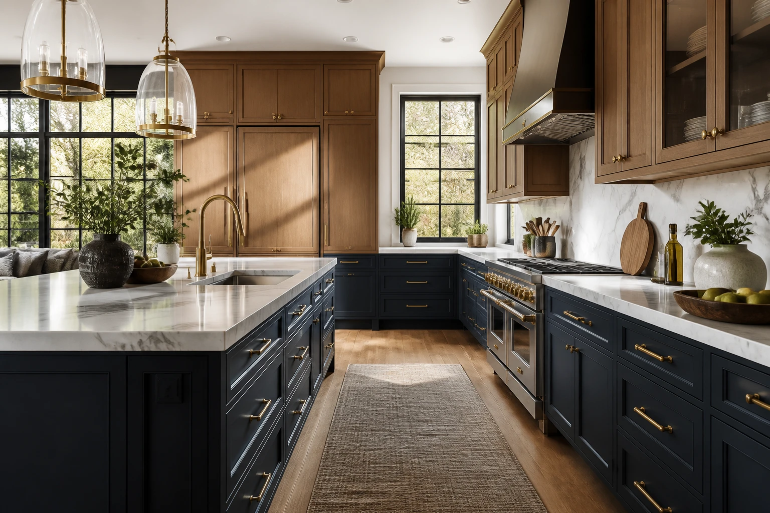
Marble countertops with heavy veining look incredible with solid, bold cabinet colors. The cabinets give your eye a place to rest between all those dramatic swooshes and swirls. Try deep greens, rich blues, or even black for maximum impact.
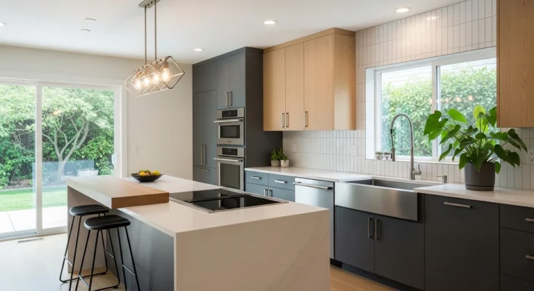
Quartzite or solid-colored quartz gives you more flexibility. You can go tonal with cabinets that are just a few shades different from your counters, or create contrast with a completely different color family. This is where those trendy two-toned cabinet schemes really shine.
Butcher block or wood countertops demand careful consideration. Too much wood grain happening at once can make your kitchen look like a log cabin. Balance wooden counters with painted cabinets in sophisticated neutrals or unexpected colors like sage or charcoal.
The Psychology of Color in High-End Kitchens
Colors mess with your mind, and in a room where you spend hours every week, this actually matters. You want colors that energize you for morning coffee but don’t make you feel like you’re inside a highlighter.
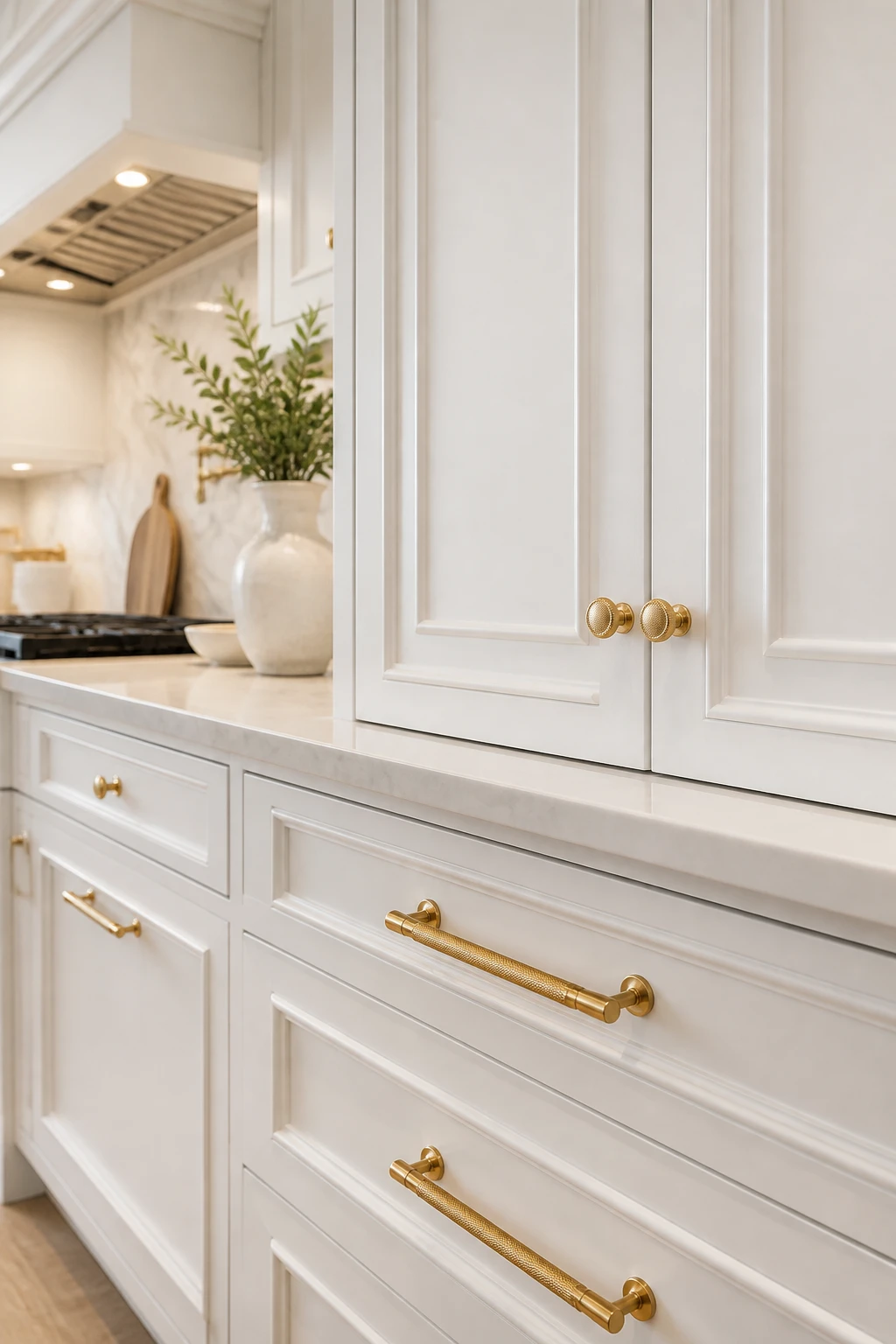
White and off-white cabinets create that clean, timeless vibe everyone claims they want. They make spaces feel larger and brighter, which is why builders love them. But pure white can feel sterile in luxury kitchens—consider warmer whites with cream or gray undertones instead.
Gray cabinets had their moment and honestly, they’re still hanging on. They read as sophisticated and modern without being as stark as white. The trick is choosing the right undertone—cool grays can feel cold (shocking, right?), while warm grays with beige undertones feel more inviting.
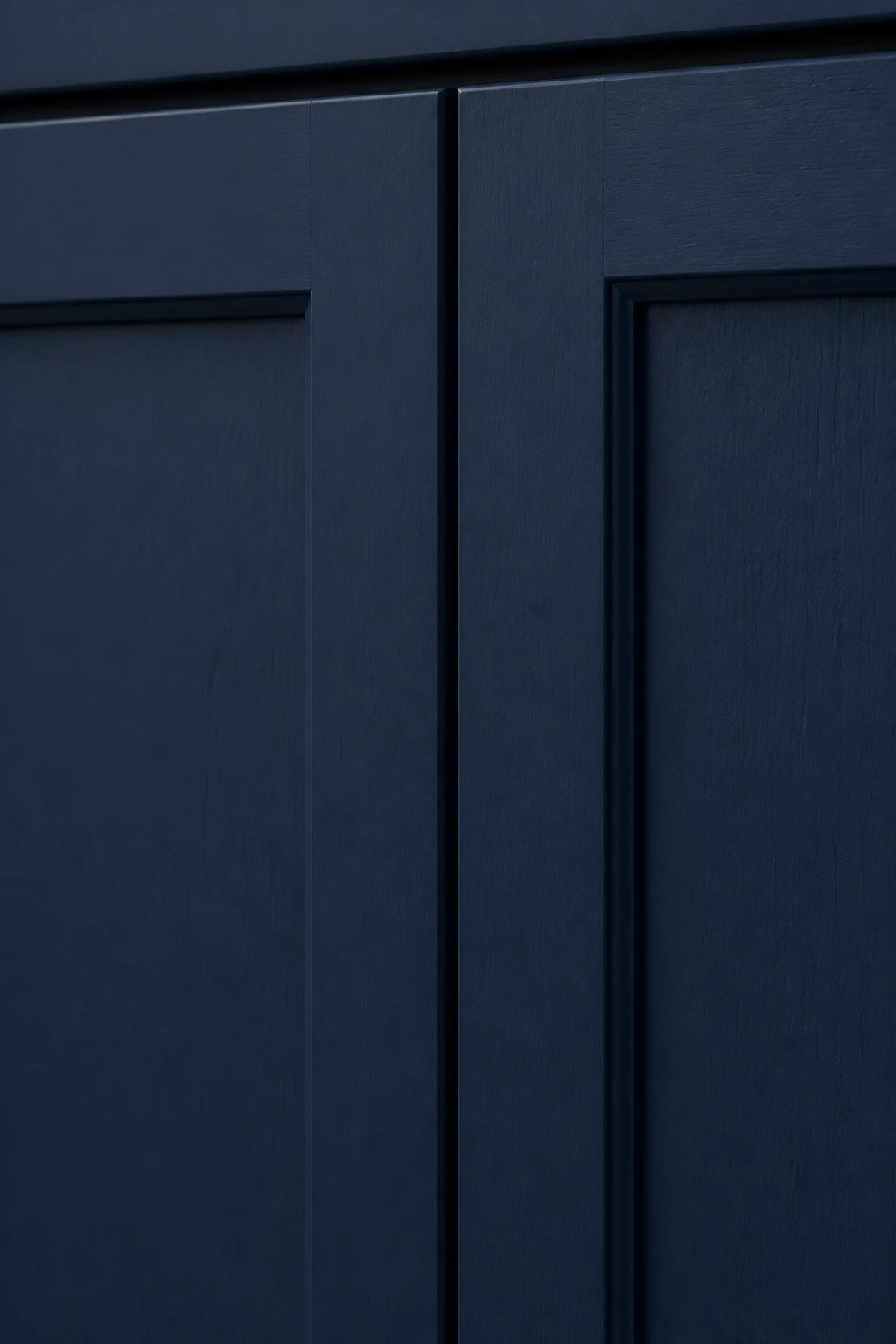
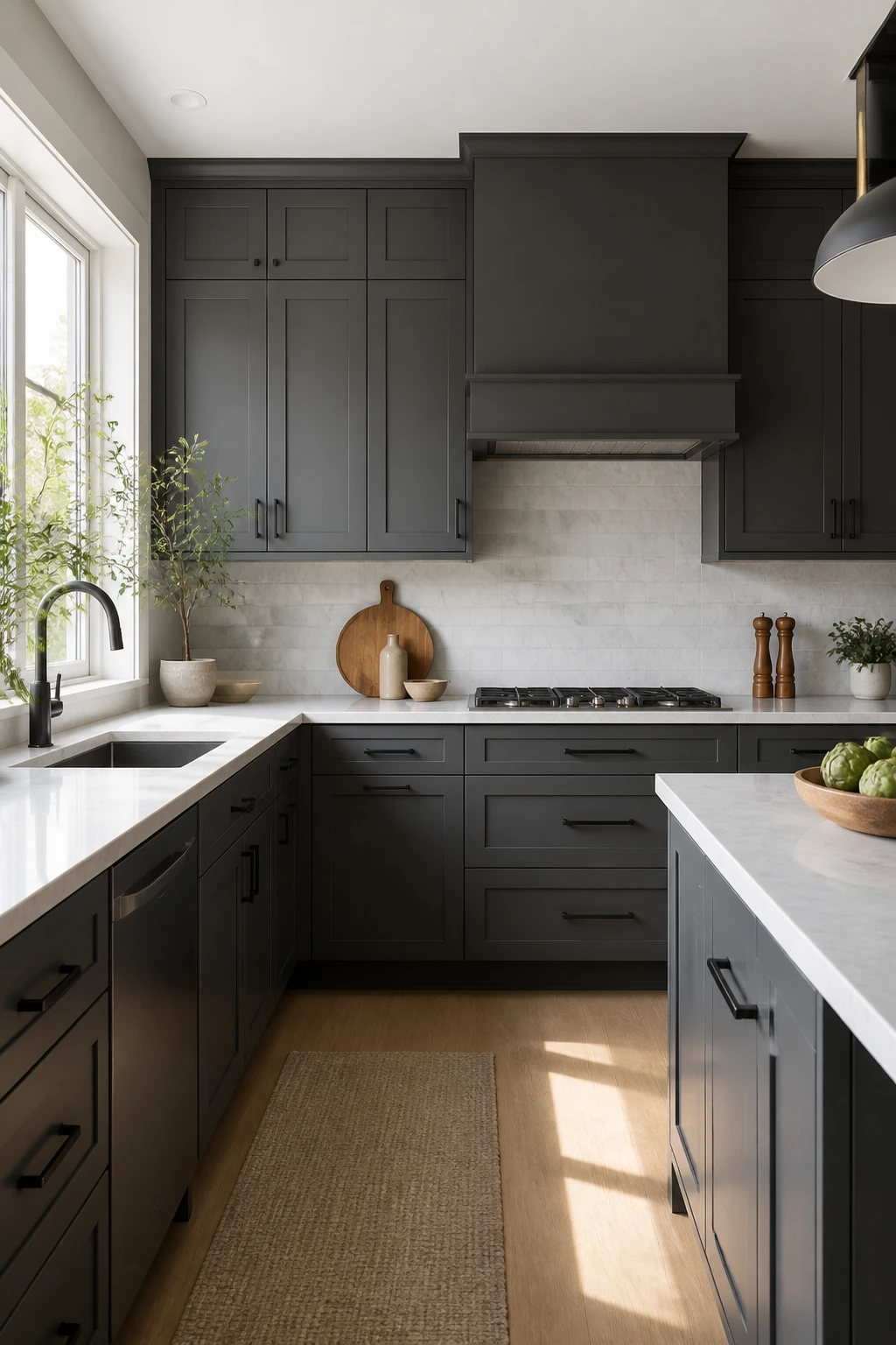
Navy and dark blue bring drama and depth without the commitment of black. They photograph beautifully and make metallic hardware pop like crazy. Just make sure you have enough light, or you’ll create a cave situation.
Green tones are having a major moment, from soft sage to deep hunter green. They bring an organic, calming vibe that feels both fresh and classic. IMO, green is the most underrated luxury cabinet color right now.
Mixing Finishes and Creating Contrast
Here’s where luxury kitchens really separate themselves from the basic ones—thoughtful contrast and finish variation. Nobody’s impressed by matchy-matchy anymore.
Two-toned cabinets let you have your cake and eat it too. Try darker lowers with lighter uppers to ground the space, or save your bold color choice for the island while keeping perimeter cabinets neutral.
This approach gives you visual interest without overwhelming the space.
Matte vs. Gloss Considerations
Matte finishes scream luxury and hide fingerprints like champions. They create a soft, sophisticated look that photographs beautifully. The downside? They can be harder to clean and may show scuffs more easily.
Gloss or semi-gloss finishes reflect light and make colors appear more vibrant. They’re easier to wipe down, which matters if you actually cook. But they also highlight every fingerprint, drip, and imperfection in your cabinet construction.
Satin finishes split the difference—you get some light reflection without the high-maintenance drama of full gloss. For luxury kitchens where you want durability and elegance, satin is often the sweet spot.
Considering Your Hardware and Fixtures
Your cabinet color needs to make your expensive hardware look even more expensive. This is not the time to forget about the details.
Gold and brass hardware looks stunning against deep colors like navy, forest green, or even black.
The warm metallic tones create this rich, layered look that screams luxury. Against white or cream cabinets, brass brings warmth and prevents that sterile feeling.
Chrome and polished nickel work beautifully with cooler cabinet colors—grays, cool whites, and even some blues. They create a sleek, modern aesthetic that feels clean and contemporary.
Matte black hardware is the chameleon of the hardware world. It works with literally everything but creates the most impact against lighter cabinet colors where the contrast really pops.
FYI, matte black does show fingerprints, so factor that into your decision if you’re picky about that stuff.
Testing Colors in Your Actual Space
This is the part nobody wants to do but everyone should do. Those Pinterest photos are lying to you—or at least, they’re showing you someone else’s kitchen with different light, different flooring, and different vibes.
Order sample doors in your finalist colors. I know it costs money, but it costs way less than hating your cabinets.
Place them in your actual kitchen space and look at them at different times of day, under different lighting conditions, and next to your actual flooring and countertops.
Take photos on your phone. Sometimes what looks amazing in person photographs weirdly, and let’s be honest—you’re probably going to photograph this kitchen approximately eight million times.
Live with the samples for at least a week.
Your initial reaction might not be your long-term reaction. Some colors grow on you, while others lose their appeal once the novelty wears off.
Thinking About Long-Term Trends vs. Timelessness
Luxury kitchen cabinets should last you 15-20 years minimum, so you need to think beyond what’s trending on Instagram this week. That said, you also don’t want to play it so safe that your kitchen looks boring.
The safest bet? Choose a relatively timeless color for your main cabinets and bring trendy colors in through easier-to-change elements like your island, backsplash, or paint colors. You get the best of both worlds—a kitchen that feels current but won’t look dated in five years.
Classic colors that have staying power include warm whites, soft grays with balanced undertones, navy blues, and natural wood tones. These have been around forever and will probably outlast us all.
Trendy colors to approach cautiously include anything Instagram is currently obsessed with—right now, that’s dusty pink, bright teal, and millennial pink. These can look amazing, but make sure you’ll love them when they’re no longer cool.
Conclusion: Trust Your Gut (But Do the Homework First)
Choosing luxury cabinet colors isn’t about following rigid rules or copying someone else’s kitchen.
It’s about understanding how color works in your specific space, considering your lifestyle, and picking something you’ll actually love living with for years.
Test everything, consider the lighting, think about how colors interact with your other finishes, and then—and this is crucial—trust your instincts.
You’re the one who has to look at these cabinets every single day. If you love it and it works in your space, that’s the right choice, regardless of what’s trending or what design blogs say you “should” do.
Frequently Asked Questions
Should I match my cabinet color to my home’s overall style?
Your kitchen should feel cohesive with the rest of your home, but it doesn’t need to be an exact match. If you have a traditional home, you can absolutely do modern cabinets—just bridge the gap with transitional elements like hardware, lighting, or backsplash choices.
The key is making the transition feel intentional rather than jarring. Think of your kitchen as a related but distinct space that complements rather than copies your other rooms.
How many cabinet colors are too many in one kitchen?
Generally, stick to two or three max. You might have one color for base cabinets, another for uppers or the island, and possibly a third for a specific feature like a hutch or pantry cabinet.
More than that and you’re creating visual chaos rather than intentional design. The exception is if you’re using different stains on natural wood—the variation is subtle enough that it doesn’t feel busy.
Do dark cabinets really make kitchens feel smaller?
They can, but they don’t have to. Dark cabinets in a well-lit kitchen with light countertops and adequate windows can feel incredibly sophisticated and spacious. The real space-killer is having dark cabinets, dark counters, dark floors, and poor lighting all at once.
If you want dark cabinets, balance them with lighter elements and invest in excellent lighting—both natural and artificial.
How do I choose between warm and cool undertones?
Look at your fixed elements—flooring, countertops, and the light your kitchen receives. If these lean warm (honey-toned wood, beige stone, south-facing windows), warm-toned cabinets will feel more harmonious.
Cool elements (gray floors, white marble, north-facing light) pair better with cool cabinet tones. You can mix warm and cool intentionally, but it requires more skill to pull off successfully.
Will colored cabinets hurt my resale value?
Quality matters more than color for resale value. Well-made cabinets in a sophisticated color like navy or forest green will hold value better than cheap cabinets in “safe” white.
That said, if resale is your primary concern and you’re planning to sell within five years, stick to neutral territory—whites, grays, and natural woods. If you’re staying put for a decade or more, choose what you love.
Can I paint my luxury cabinets later if I change my mind?
Technically yes, but it’s expensive and somewhat defeats the purpose of buying luxury cabinets in the first place. High-end cabinet finishes are applied in controlled factory settings with better durability than field painting can achieve.
If you think you might want to change colors down the road, either choose a timeless color now or consider slightly less expensive cabinets that you won’t feel guilty about refinishing later.